Brochure Design Best Practices for Maximum Impact
A great brochure can be your most effective sales tool. Learn proven brochure design tips covering layout, typography, imagery, and content strategy that turn readers into customers.

Brochures remain one of the most versatile and effective marketing tools in print. A well-designed brochure tells your brand story, showcases your products or services, and gives potential customers a tangible piece of your business to take home and review. But designing a brochure that actually achieves these goals requires more than throwing text and images onto a page. These brochure design tips will help you create brochures that engage readers, communicate your message clearly, and drive results.
Start with Strategy Before Design
Before you open a design application, answer three critical questions:
Who Is This Brochure For?
A brochure for prospective clients is different from one designed for existing customers or trade show attendees. Define your primary audience and tailor your messaging, tone, and design choices specifically to them. A brochure targeting corporate decision-makers should feel polished and data-driven. One targeting creative professionals can be more visually adventurous. Clarity about your audience drives every design decision that follows.
What Is the Primary Goal?
Every brochure should have one primary goal. Is it to generate leads? Explain a complex service? Introduce a product line? Support a sales presentation? The goal determines your content priorities, call to action, and overall design approach. A lead generation brochure needs a compelling offer and clear response mechanism. A product catalog brochure needs organized product information with specifications and pricing. Trying to accomplish too many goals in a single brochure dilutes all of them.
How Will It Be Distributed?
The distribution method affects format, size, and paper choices. Brochures mailed directly to prospects need to fit standard envelope sizes or comply with USPS mailing requirements. Brochures displayed in a rack need a compelling front panel that works at rack height. Brochures handed out at events should be compact enough to carry easily. Choose your brochure format based on how it will reach your audience.
Choosing the Right Brochure Format
The format of your brochure affects how readers interact with it. Here are the most effective options:
Tri-Fold Brochure
The tri-fold, also called a letter fold, is the most popular brochure format. A standard letter-size sheet folded into three panels creates six panel faces for content. The tri-fold works well because it is compact, fits in a standard #10 envelope, and creates a natural reading sequence. The front panel acts as a cover, the inside panels unfold to reveal the main content, and the back panel typically holds contact information and a call to action.
Bi-Fold Brochure
A bi-fold, or half-fold, brochure creates four larger panels that allow for more spacious layouts with bigger images and more breathing room. This format works well for portfolios, property listings, event programs, and any content that benefits from a larger presentation area. The front panel is the cover, the two inside panels create a wide spread, and the back panel provides supplementary information.
Gate-Fold Brochure
A gate-fold has two panels that fold inward to meet at the center, then open outward to reveal a full-width inside panel. This format creates a dramatic reveal moment that works beautifully for luxury brands, real estate, and high-impact product launches. The gate-fold is more expensive to produce than standard folds but creates a premium presentation experience.
Multi-Page Booklet
For content that exceeds what a folded brochure can hold, a saddle-stitched or perfect-bound booklet provides the space for detailed product catalogs, annual reports, or comprehensive service guides. Booklets can range from 8 pages to over 100 pages and are typically printed on lighter paper stock with a heavier cover.
Layout and Design Principles
Create a Clear Visual Hierarchy
Visual hierarchy guides the reader's eye through your content in the intended order. Use size, weight, color, and placement to establish importance. Headlines should be the largest and boldest text elements. Subheadings should be visually distinct from body text but subordinate to headlines. Body copy should be easy to read at a comfortable size, typically 10 to 12 points. Use consistent spacing and alignment to create a clean, organized structure.
Use a Grid System
Professional brochure layouts are built on grid systems that create consistent alignment and proportions throughout the piece. A grid does not mean your design will be boring; it means your design will be organized. Within a grid framework, you can create dynamic layouts by varying image sizes, breaking columns, and creating visual interest while maintaining an underlying structure that holds everything together.
Embrace White Space
One of the most common brochure design mistakes is filling every available space with content. White space, or negative space, is not empty space; it is a design element that improves readability, creates emphasis, and gives your brochure a professional, premium feel. A brochure with generous margins, line spacing, and breathing room around elements feels more sophisticated and is easier to read than one crammed with content.
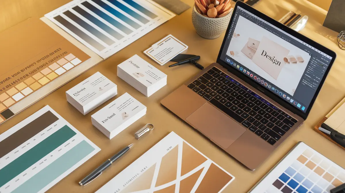
Use High-Quality Photography
Images are the first thing people look at in a brochure, and low-quality photography undermines even the best layout. Invest in professional photography for your key images. If professional photography is not in the budget, use high-quality stock images that feel authentic and relevant to your brand. Avoid generic, obviously staged stock photos that feel disconnected from your message. Every image should serve a purpose: illustrate a benefit, show a product in use, or evoke an emotion that supports your message.
Writing Effective Brochure Copy
Lead with Benefits, Not Features
Your readers do not care about features until they understand the benefits. Instead of saying "Our software includes automated report generation," say "Save 10 hours a week with automated reports that write themselves." Benefits answer the question every reader is asking: "What is in it for me?" Lead every section with the benefit, then support it with the feature or evidence.
Keep It Scannable
Most people scan brochures before they read them. Use short paragraphs, bullet points, bold subheadings, and pull quotes to break up text and make key points accessible to scanners. If someone can understand your core message by reading only the headlines and bullet points, your brochure copy is well structured.
Include a Strong Call to Action
Every brochure needs a clear, specific call to action that tells the reader exactly what to do next. "Contact us" is weak. "Call 555-123-4567 for a free consultation" is strong. "Scan this QR code to see our portfolio" is specific and actionable. Place your primary call to action prominently on the back panel and consider including secondary calls to action on interior panels.
Paper and Printing Considerations
The physical quality of your brochure communicates as much as the content. Choose a paper stock that matches your brand positioning. A 100 lb gloss text stock produces vibrant colors and a premium feel. A satin or silk finish offers richness without the reflectivity of full gloss. Matte stocks create an understated, sophisticated look. For more guidance on paper selection, see our paper stock guide.
Consider adding specialty finishes to your brochure cover. Spot UV coating on your logo, a soft-touch lamination for a luxurious feel, or foil accents for a premium touch can differentiate your brochure from competitors. These finishes add cost but significantly increase perceived value.
Common Brochure Design Mistakes
- Too many fonts: Stick to two fonts maximum, one for headlines and one for body copy. Too many typefaces create visual chaos.
- Inconsistent alignment: Mixing left-aligned, centered, and right-aligned text on the same panel looks disorganized. Choose one alignment style and use it consistently.
- Ignoring the fold: Critical text and images should not be placed across fold lines where they will be obscured or bisected. Plan your content around the folds, not in spite of them.
- No proofreading: Typos and grammatical errors in a printed brochure are permanent and embarrassing. Have multiple people proofread your content before it goes to print.
- Missing contact information: It sounds basic, but every brochure should include your phone number, email, website, and physical address if applicable. Make it easy for interested readers to reach you.
Ready to create a brochure that delivers results? Browse our brochure and booklet printing options to see our available formats, paper stocks, and finishing options. Need design help? Contact Printing247 and our team will guide you from concept to finished product.
Need Professional Printing?
Turn your designs into reality with Printing247. Premium quality, fast turnaround, and nationwide shipping.